Workbench Design System
Workbench is an extensive product that encompasses our design philosophy, design tokens, creative assets, React components, utilities—and documentation. Workbench is built, designed, and maintained by Gusto’s Design Systems team. In addition to the Workbench website, the team also maintains Gusto’s Design Tokens, Figma UI Kit, global CSS frameworks and Component Library.
Role & team
The Design Systems team consists of three designers, five engineers, and one product manager. In my role as the IC design lead, I am responsible for fostering collaboration with cross-functional partners to ensure alignment and establish a clear direction for various aspects, including but not limited to contribution models, roadmap planning, and component prioritization. Additionally, I work closely with feature designers, engineers, and research counterparts to deliver a top-tier experience to our customers while effectively supporting our internal product design team, which comprised of more than thirty designers. Learn more about our team, mission and goals here.
Recent Projects
Projects I have recently lead and shipped within the past year include but are not limited to Stepper, DescriptionGroup, DataView, Control Layout, DataCard, Table, DataGrid, Empty state, Error patterns, Pagination, DateField, Autocomplete, Crash, PageHeader, PageLayout, and Layout grid.
DescriptionGroup
A DescriptionGroup is a list of items used to organize unique objects of a related topic. Read more about this component here.
DataGrid
DataGrid is similar to Table, paired with Control Layout and Pagination to allow for bulk actions, searching, sorting, and filtering of data. Read more about this component here.
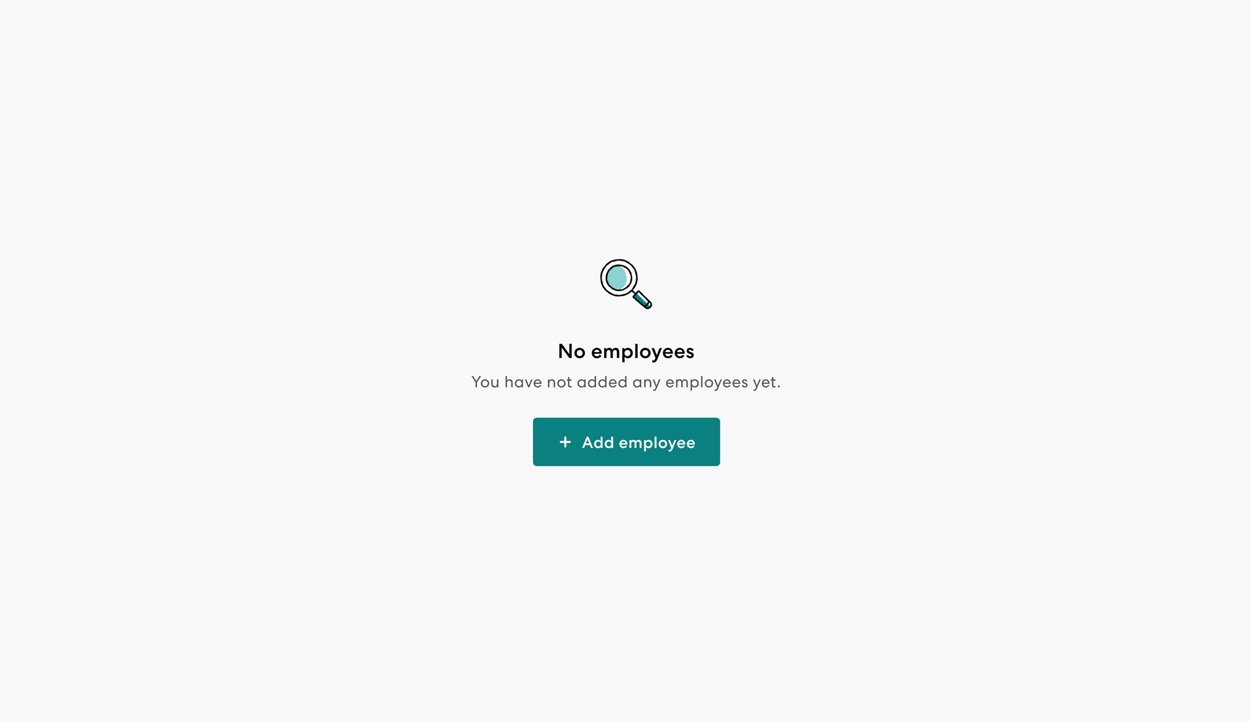
Empty state
An Empty state is a pattern used when there is no content to display. Empty states provide context into why content is unavailable and may contain action(s) for customers to take. Read more about this component here.
Error patterns
Error patterns is a collection of error guidelines to support a consistent, intuitive and accessible error handling experience. Read more about this pattern here.
Pagination
Pagination divides content and data into separate pages or datasets with controls utilized for navigation. Read more about this component here.
DateField
DateField is a set of inputs to define a date, accompanied by the DatePicker. Read more about this component here.


