

Design Tokens
Design tokens are a way to store hard-coded values including but not limited to color, spacing and radius to achieve a scalable and consistent system.
During my time at MasterClass, I played a key role in establishing a versatile and adaptable token system for our design system, Excalibur. This strategic move not only enabled us to scale efficiently but also positioned us for success in future theming efforts.

Token Structure
In developing our design system, Excalibur, we created a well-defined naming convention to ensure precise token naming. Our naming convention comprises three main sections: base, element, and modifier. Each of these sections is further subdivided to provide detailed token names.
Under 'base,' we have system, concept, and property. Within 'element,' we include component, group, and item. Finally, 'modifier' encompasses variant, value, and state. This systematic approach empowers us to consistently and effectively name tokens throughout our entire product ecosystem.
Token naming
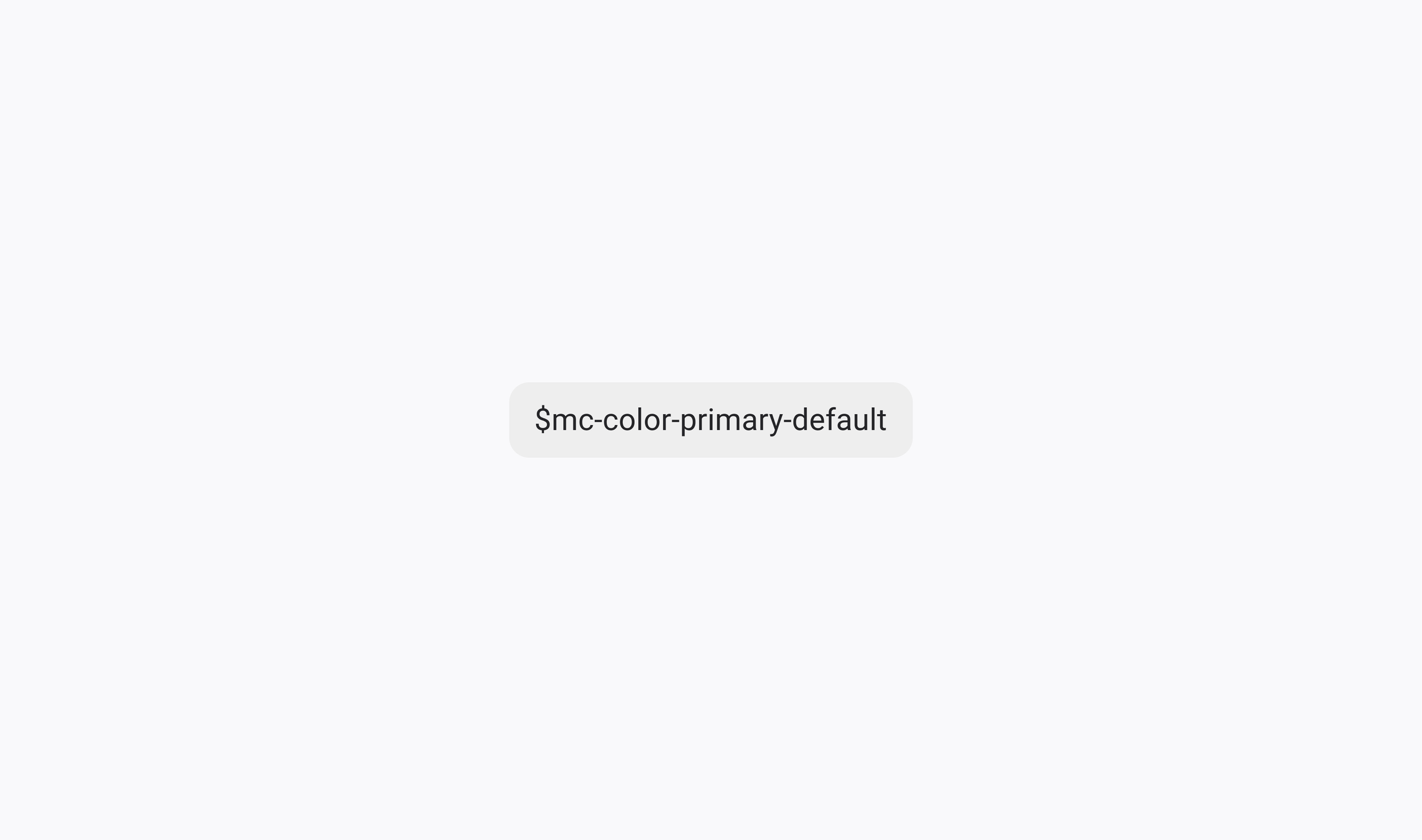
When naming tokens, it's essential to focus on their function rather than specifying a particular value. For instance, when capturing the background color of a button, the token should follow a structure like $mc-color-bg-button-primary-default. This approach enables us to maintain consistency across various themes. If we were to name a token based solely on its value, such as $mc-color-bg-button-red-default, it wouldn't be adaptable to different themes. If, in another theme, the button needed to be white, this token would no longer serve its purpose. We categorize our tokens into three distinct types – Global, Alias and Component-specific.

Global tokens
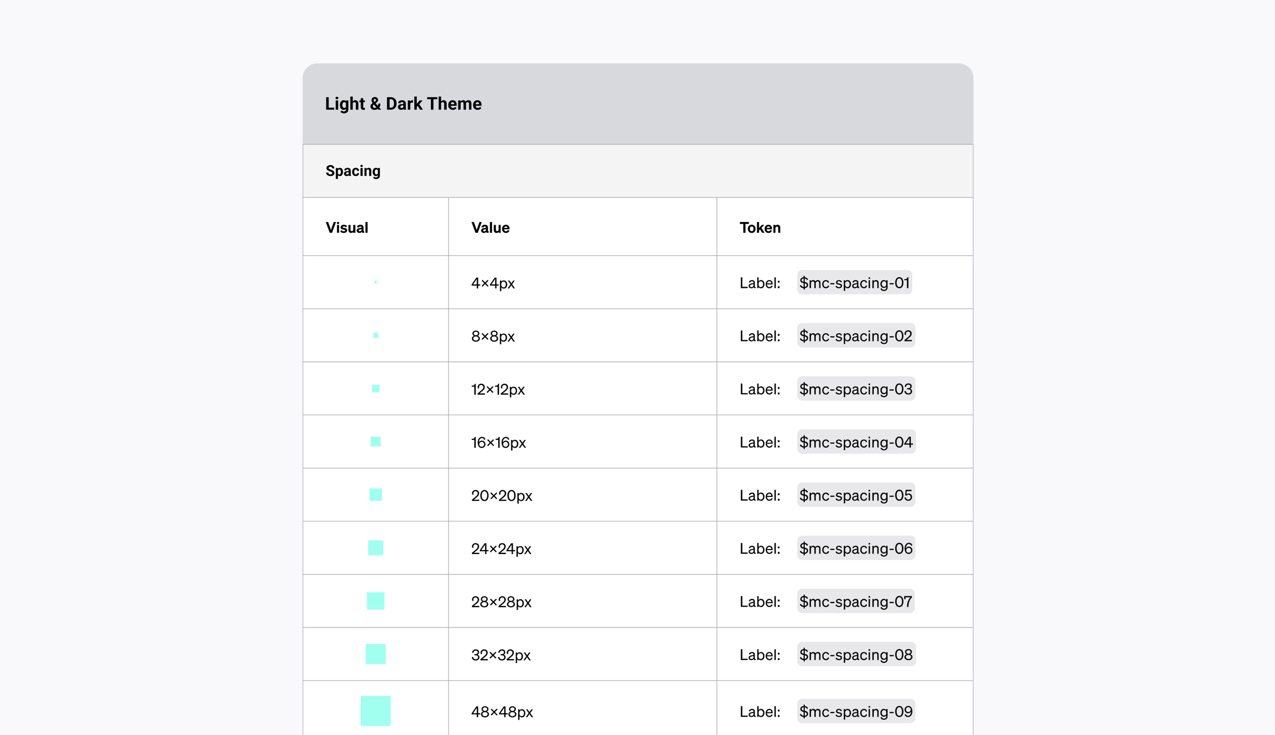
Global tokens are reserved for primitive values, which include essential design elements such as color, spacing, type and elevation. These tokens serve as the foundational building blocks for our token system.

Alias tokens
Alias tokens are used when referring to a specific context like default, hover, focus, etc. They are helpful when we need to understand and/or communicate the specific purpose of a token.
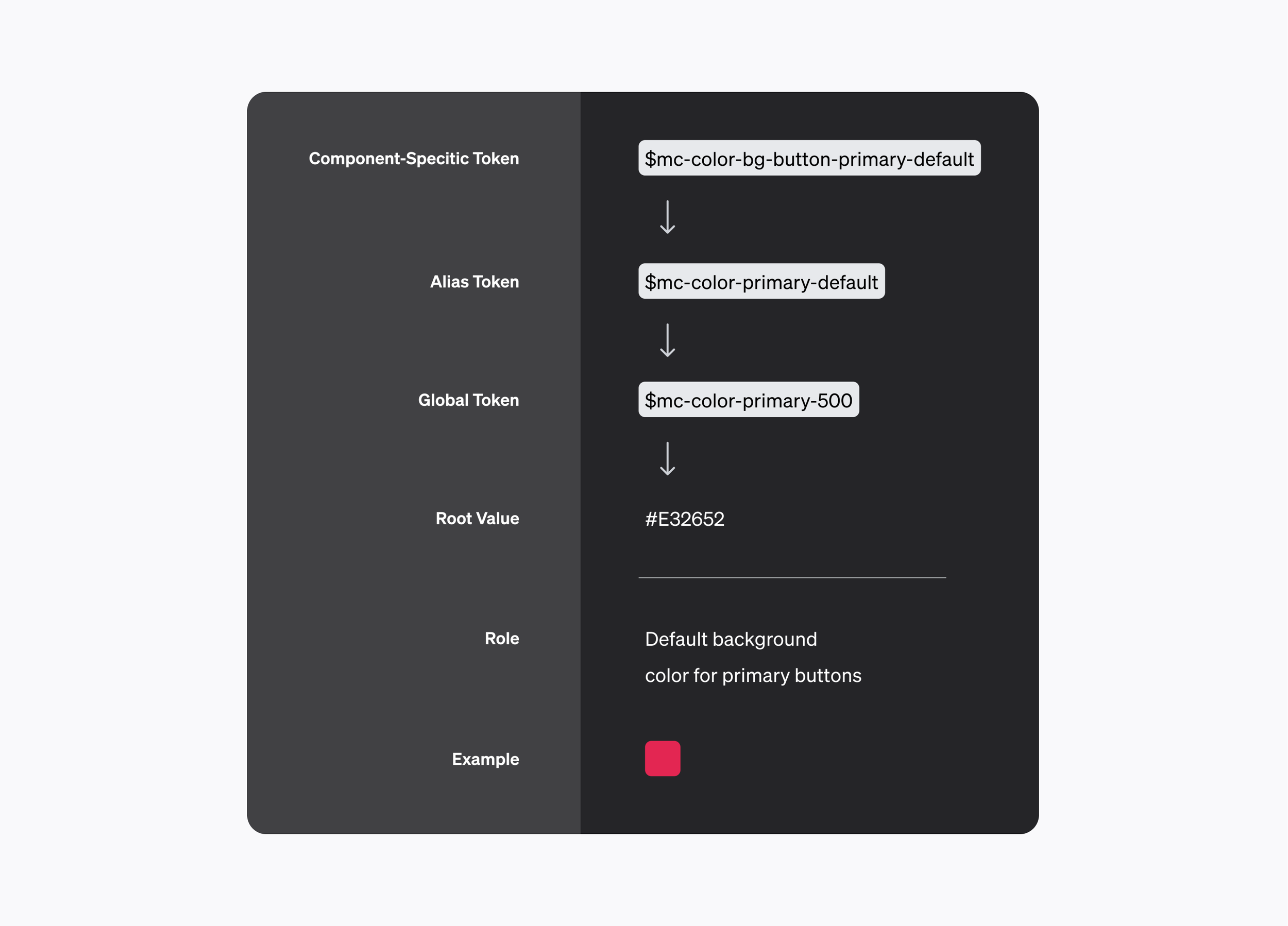
Component-specific tokens
Component-specific tokens are written when referring to a value associated with a component. For example, the background color of a button, the elevation level of a modal, etc. They should be written to be extremely specific that way if a value needs to change from two different components utilizing the same color, one component can be adjusted while the other can remain.
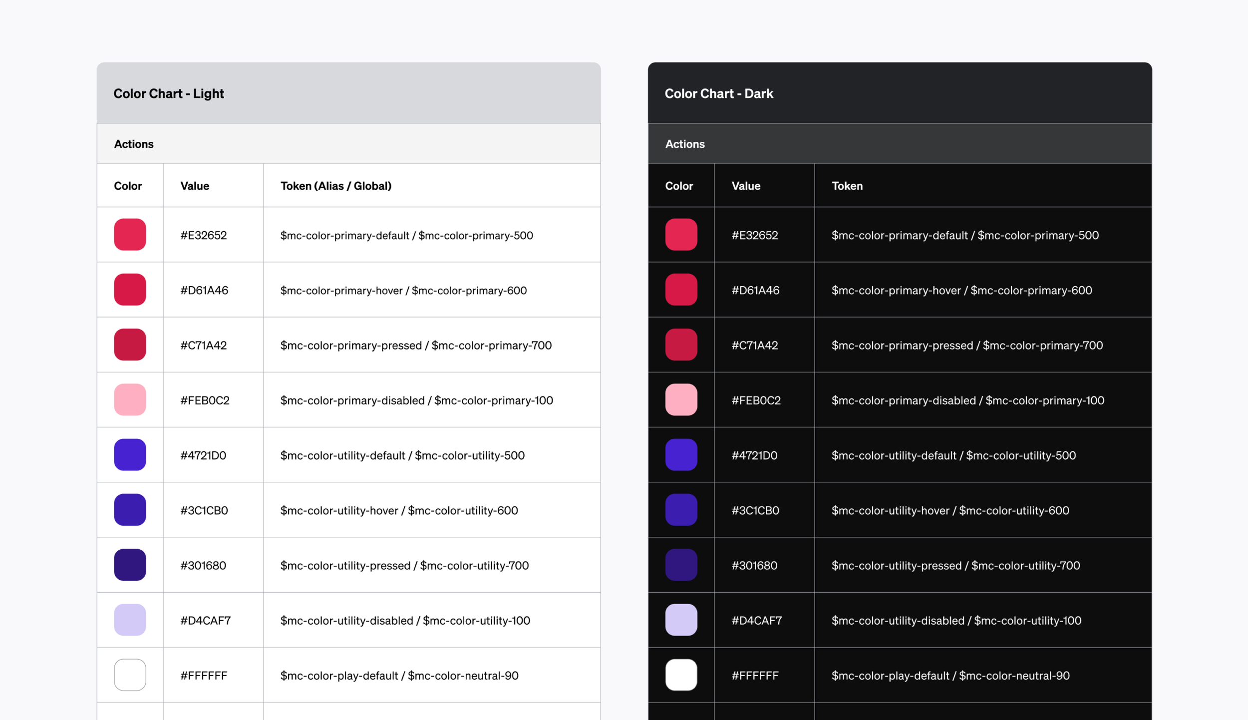
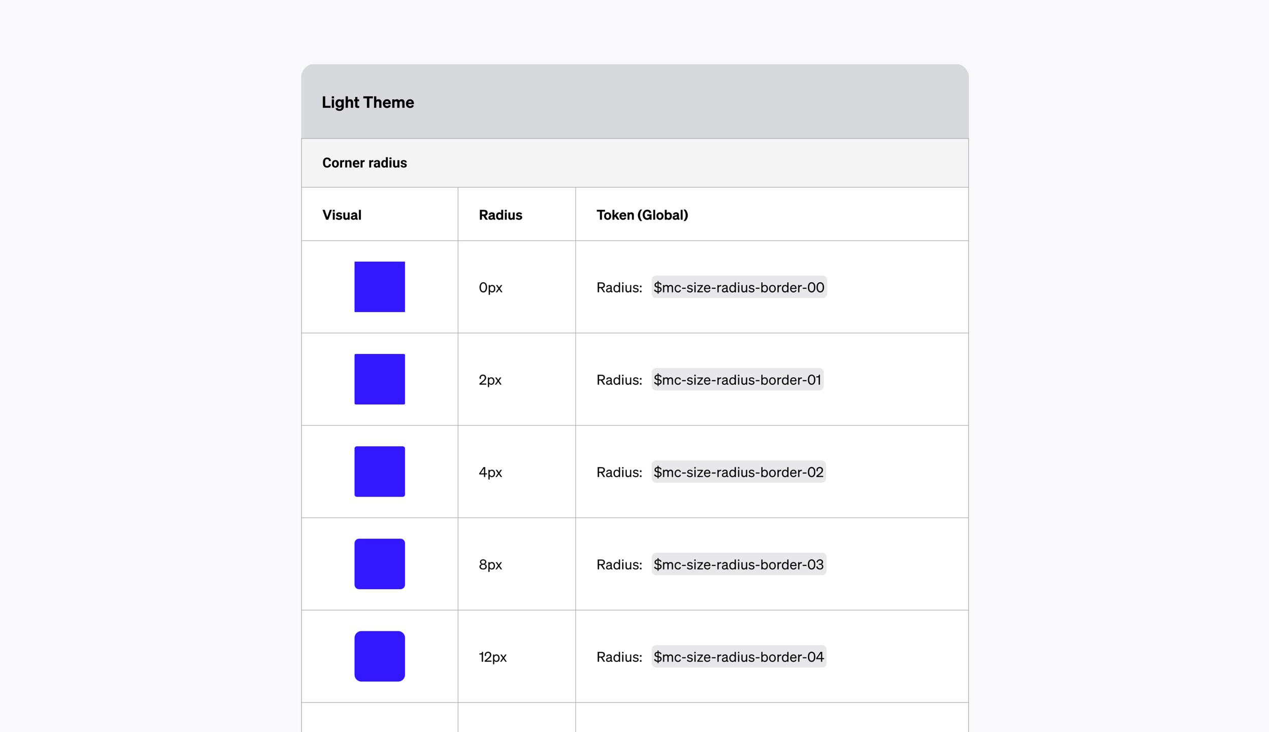
Applying tokens to primitives
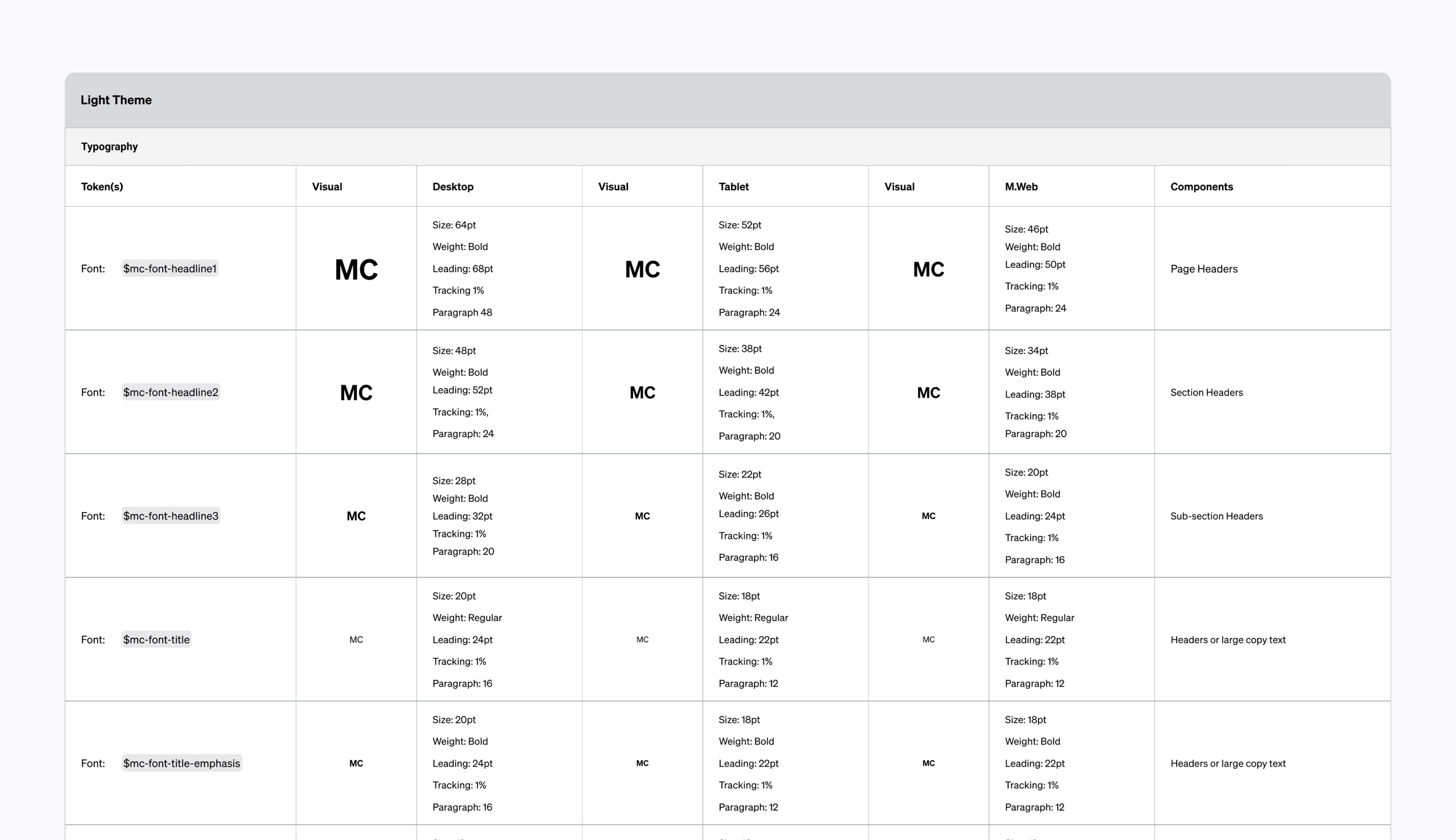
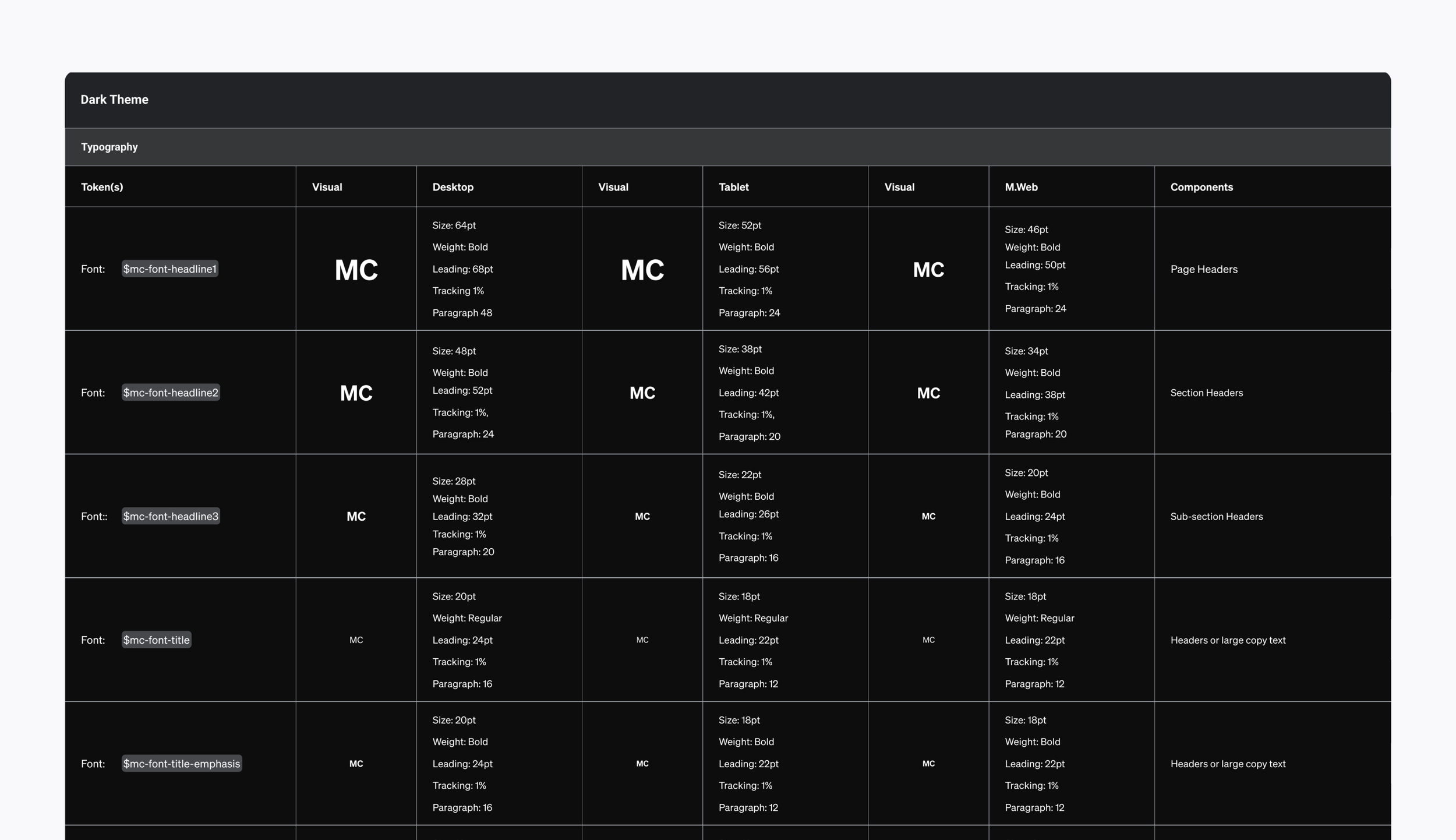
The above examples showcase Excalibur’s token system for color, corner radius, spacing and type.