

Matisse Design System
Within GoodRx, the term “Matisse” originated as the project for updating and unifying the visual design of our app in late 2020/early 2021 hence, this version of GoodRx’s design system is called the Matisse Design System or MDS. MDS for web was created to support parity between the app and web experience. MDS is comprised of components, patterns, and guidelines to ensure visual consistency across our product.
Problem
Our app was redesigned, updated and our web platform was still using our legacy system. The FEP team needed to transition all app styling onto web. This also needed to be housed in a single source of truth for design and code.
Solution
Create a library of flexible and scalable components for all product designers to use in feature-level work. We wanted to think beyond creating components and include UI documentation, guidelines, and examples to create a design system that was scalable & robust.
Role
My original role was to work alongside a lead product designer to define the visual and behavioral structure of the Matisse Design System. About 1/3 of the way through this initiative, the MDS’s lead product designer left leaving me as the new lead on this effort. I was responsible for not only component creation but also roadmapping, planning, and coordinating XFN team work as I was the main POC for MDS moving forward.

Matisse Design System (Figma)
MDS is comprised of several levels of design including primitives, components, patterns, tokens and themes. All of the components are housed in Figma and they are built atomically (atoms, molecules, organisms and page templates) but they are organized in Figma by functionality - notifications, inputs and controls, etc for a better adoption rate.
Talk how it’s built atomically but organized by functioinality.
Lighting System
All components are organized using a lighting system so we can understand at a glance and track where they are currently living in the design and engineering process. If you take a look in the screenshot above, you’ll notice different colored dots living next to each item’s name.
Green: Design & engineer sign-off with tokens, reflected in Storybook.
Purple: Design & engineer sign-off with tokens, not reflected in Storybook.
Blue: Design & engineer sign-off with no tokens.
Orange: Design sign engineer waiting for engineer review.
White: In design process.

Matisse React (Storybook)
Matisse React is where MDS lives in code and is the main umbrella of our design system. Matisse React also enables themes meaning all of its design elements behave functionally as Matisse React components but they capture a different look and feel from theme to theme. For example, a button with a Matisse theme may be yellow and in another theme like Kroger, it may be blue however both buttons behave the same since they are both Matisse React components.
Matisse React - Themeing
As mentioned prior, Matisse React captures theming. The above video demonstrates how we can toggle between the different themes - Matisse, HeyDoctor and Kroger.
Explain what the video is doing, etc.

How we work
The FEP (Front-End Platform) Team is a horizontal that is embedded into other verticals to work collaboratively and understand what new components are needed, what current components can be utilized, and how designers on MDS can prioritize FEP roadmap to meet deadlines.
At a high level, the FEP team will do an audit on all screens outlining every component that is needed for a specific flow to be built. During this process, we will identify all components needed for a flow, all components that are already built, and all new components that are needed.
FEP team will both build components and own end-to-end flow(s) during the collaboration process.

Defining our primitives
Primitives are the building blocks for all components. They’re the most basic elements of a design system - colors, typography, radii, etc.
We needed to identify primitives for the following:
• Typography
• Color
• Elevation
• Spacing
• Grid
• Icons
• Divider
• Radii

Color, Spacing, Typography
Here we have three of our primitives - color, typography and spacing. These pages are quite in terms of functionality and UI documentation however we made sure to include roles, tokens and any other helpful information for design and engineering.

Component Audit
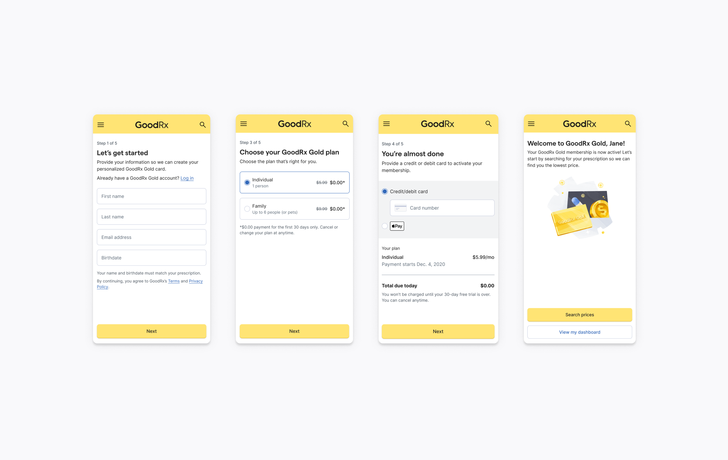
Our first task with MDS was to "Matissify" the Gold Registration sign-up flow. We started an audit on all screens by highlighting each UI element and identifying what component(s) we needed to build.
We kept a legend at the top of the audit identifying where the components stood in Figma and Storybook.

Component Status - Gap Analysis
After understanding and identifying what components we need through our audit, we track all components and their progress in a spreadsheet. We do this to understand the following:
In Figma (Design)
• Is it designed?
• Is it signed off by engineering?
• Does the component have tokens?
• Are tokens signed off by engineering?
In Storybook (Engineering)
• Does it exist in Storybook aka, is it a Matisse React component?
• Does the Storybook component match the Figma file aka, is it themed?
• Is the component UATed?
• Is the component done?

Building components
When building components we identify the following:
• Overview
• Anatomy
• Behavior
• Modifiers: True/False
• Variants: States
• Do & Don’t examples
We will also identify if the component is React ready in Storybook by providing a link and addressing if it’s built & skinned with the Matisse theme.

Components: Radio Button, Tag, Input field
Here are three examples of our component documentation. One key tip we do when creating/designing any component is to always place them into mocks throughout the building process to understand if the component we are creating will work in context.

Component Variants - Behavioral Differentiators
Another item ensure to include in the component documentation is to identity if there are specific variants that behave differently. Input Field for example has a few different behavioral patterns across different input types including but not limited to normal input, birthdate input and mobile number input. Documenting this behavior is extremely helpful for engineering.

Do & Don’t examples
We found it very helpful for other product designers to include do & don’t examples. After launching our v1 of Matisse Design System, there were a lot of cases where specific components are not being used the in right way. We decided to include these examples to give more guidance to avoid components being used incorrectly in the future.

$Tokens
After a component has been signed off by design and engineering it then needs to be tokenized. Design tokens are a way to store variables such as typography, color, and spacing that are platform agnostic. After doing so we then map the tokens to primitive values in each theme and that allows us to support multiple themes in our design system.
When assigning tokens, it’s important to assign by functionality and not value. For example, if we are assigning a token to the background color on a blue button we would use something along the lines of $background-primary-default and not $background-blue because the default background in another theme might not be blue.
Recap
Impact
• Hit our Q2 goal of getting two verticals 100% on MDS by the end of the quarter.
• Achieved 1:1 parity across web and app.
• Set up for success with future theming.
What I learned
• Communication with XFN team & partners is key to success and hitting goals.
• Successful system design will require you to think like an engineer.
• When and when not to make additions and modifications to components.
Improvements to be made
• Figure out a way to effectively version control in Figma.
• Hold more education sessions to help others understand the benefits of a successful design system.
• Consolidate all items into one single source of truth that is easily accessible.