

Design System
This was the first design system built for GoodRx, 1.0 for mobile web and desktop. We standardized and archived the most-used components to help visual consistency throughout our product.
Problem
Our mocks are starting to show inconsistencies from designer to designer in terms of spacing, type size, color, etc. For example, we are starting to see different shades of our primary CTA blue on the hover state.
Solution
Our goal was to create a library of elements including but not limited to buttons, color palette, icons, and typography for all product designers to use on for mobile web and desktop mocks. We also wanted to freshen up, standardize, and update our current elements to improve user experience and create more consistency throughout our designs. We believe by creating elements systematically, this will speed up design and build time internally.
Role
As one of the two designers on this project, we were responsible for leading and defining the overall structure of the design system. We worked hand and hand with engineering to ensure all elements were created properly and lived accurately on the GoodRx mobile and desktop website.
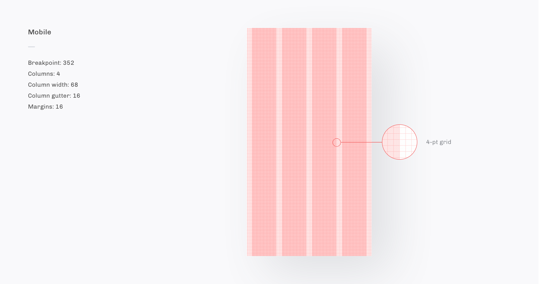
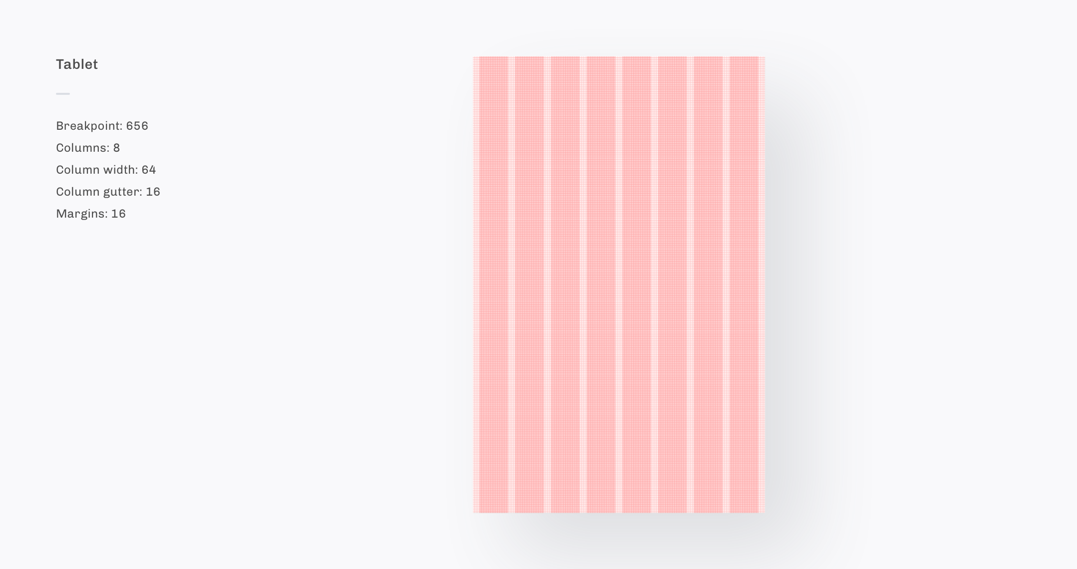
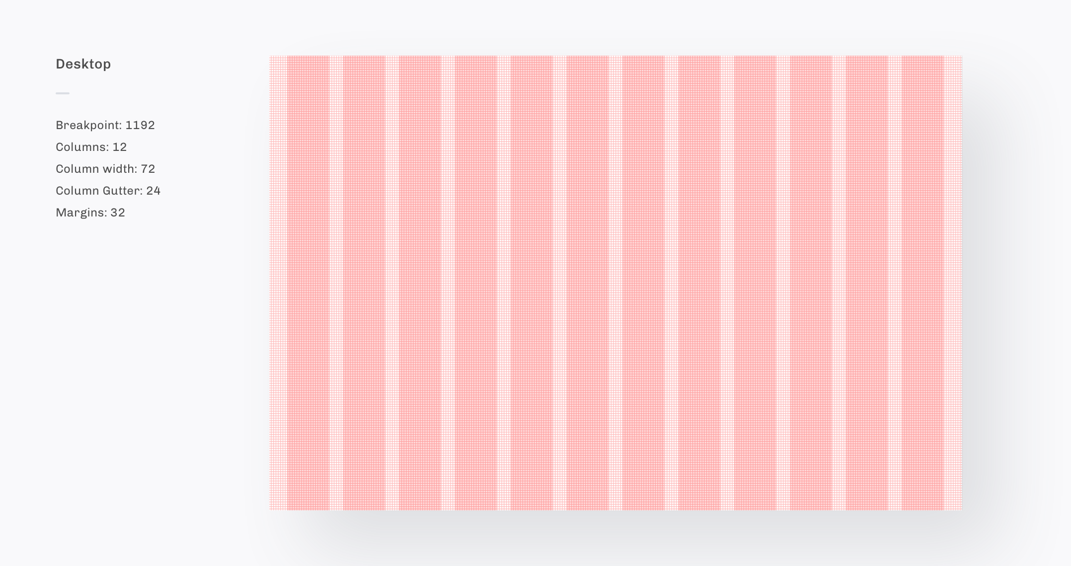
Responsive Grid
We created a 4-point grid for mobile, tablet, and desktop. All elements including dimensions, padding, and margins use measurements that are multiples of 4. This is a proven method to not only improve the visual consistency of designs but also allows for more flexibility across platforms with varying screen sizes.
Responsive Grid example
To the left we have the grid turned on showing the grid, bounding boxes, and pixel measurements of spacing and element sizes. To the right, we have the finalized product as a user would see it.
Color
When creating out color palette we made sure to keep accessibility compliance in mind. By using Stark, we checked the contrast of all typography + background colors to ensure it met the recommended contrast ratio.
Color contrast
The W3C recommends a contrast minimum of 4.5:1. To the left, we have our original primary blue with a contrast ratio of 3.27:1, not meeting requirements. To the right, we have our updated primary blue with a contrast of 4.51:1 meeting the recommended contrast ratio.
Determining color values
When creating darker or lighter shades for a specific color we wanted to build a defined system to determine what the appropriate values and shades should be for each step. Our rationale here is to have 3 colors — Primary White, Primary Blue, and Primary Black — with 8 shades in-between each step. This results in each shade/circle being 10% darker as you move from left to right.
01: Normal
02: Hover
03: On Click
Iconography
We use Material Icons by Google, this gives us the flexibility to pull from a library of selections in a short amount of time. Each Icon is placed inside of a 24x24px bounding box to ensure proper alignment with the grid & other elements in our designs.
Typography
Using a serif and sans serif typeface combination is not only visually appealing but also creates more contrast between the header and body which helps guide the user's eye for a more optimal reading experience. When selecting our product’s typeface we wanted to choose two families that felt considered, trust worthy and easy to read. Our product typefaces are Tiempos Headline for headers and Akkurat for body. All type is set in sentence case.
Type with the grid
While the type size itself does not have to be a multiple of 4 the leading (line-hight) must be to ensure that all type will stay conformed to the grid.
Buttons: rules
Primary
Used for actions that are required to take the user to the next step or to complete an important task. For example, Submit, Send, etc.
Secondary
Used for multiple equally-weighted progression actions for users to take. For example, Get started (Primary) or Maybe later (Secondary).
Tertiary
Used for actions that take the user back to the previous step. For example, a cancel or go back button.
Link
Used for actions that disrupt the current flow and either take the user to a different page or offer more/other/different information outside of the current UI such as:
Actions navigating the user to another page. For example, Done, Learn more, etc.
Used to change the action of the primary button. For example, a use mobile number instead underneath the primary CTA.
Buttons: anatomy
Our buttons are constructed by adding padding to the typography (and icon when used) component on all sides. This allows the width of the button to be determined by the label. In a case where two buttons are stacked, they will either be full width or will take the width of the longest button depending on screen size and placement.
Buttons: Height
Regular buttons — 48px tall
Regular buttons are to be used when the CTA is a stand-alone element. For example, a “Submit” button at the bottom of the screen.
Large buttons — 56px tall
Our form fields are 56px tall to allow a comfortable fit for the eyebrow description and entered text. Large buttons are used when next to form fields with a matching pixel height so both elements align neatly and consistently.
Text Fields
Interactive elements that allow users to input information. For example, filling out your name, address and so on in a checkout flow.
Dropdown
A list of options presented to a user to select. Depending on the drop down, users may either select one or several options.
Search bar
Enables users to locate a specific drug to find coupons.
Search w/ text CTA vs search w/ Icon CTA
Search w/ text CTA
Used in most cases to indicate what the CTA will do for the user. For example, find coupons, text coupon, etc.
Search w/ icon CTA
Used to reserve horizontal width. For example, search bars in the header, mobile web, etc.
Selectors
Radio button
Radio buttons are used to select one item in a list.
Checkbox
Checkboxes are used to select multiple items in a list.
Arrow
Arrows are used as navigation to display more content.
Accordion
A vertically stacked list of headers that hide or reveal sections of content. An accordion is used to organize information and reduce page length.