

Copay Savings Card
The Copay Savings Card allows users to combine their health insurance with a savings card to receive affordable prices on costly medication. This feature was created for mobile web, desktop, iOS & Android.
Problem
Even with a GoodRx coupon prescription cost can still reach over $1,000 on high priced brand drugs with no generic alternative. This leaves the user with no gain and can result in negative brand perception.
Solution
To create a feature that would help guide the user to an affordable alternative when coupons offer little to no help.
Role
As the sole designer of this project, I worked closely with the team product manager, VP of Design, sales team, and engineering team to ensure a cohesive and seamless experience from start to finish. Since this was a sellable feature, we wanted to ensure that we were creating a feature that felt considered, cost-effective, and attractive from both a sales and design standpoint.
user Flow
We wanted to make sure our design was transparent, intuitive, and time-efficient. For example, anytime a user answers a question that disqualifies them, they are sent directly to the rejection screen even if they are on the first step.
Wireframes
We wanted the user to feel comfortable utilizing this feature while educating and informing them without an overwhelming cognitive load.
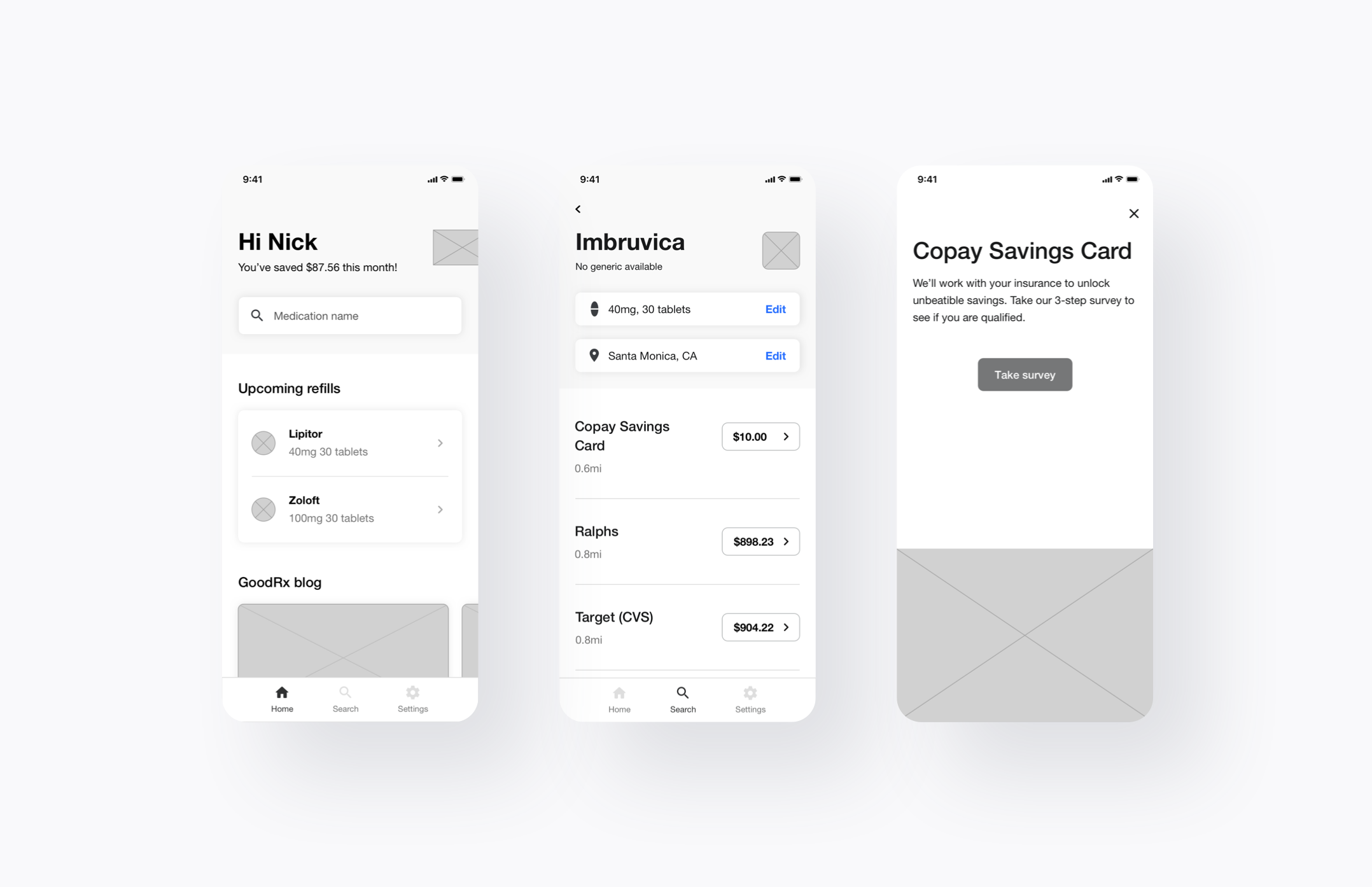
Feature placement
We concluded that integrating the Copay Savings Card into the price rows helped support a seamless experience for two reasons. The first being that we wanted to avoid this feature looking like an ad. Having a module or up-sell somewhere inside of the price row may take up more real estate but might result in being overlooked since the user's main objective on the price page is to price compare. The second reason is that users are very familiar with how price rows work and function. Integrating the CTA into the price row following with a full-screen modal with more information on the Copay Savings Card made more sense from both a UI and UX standpoint.
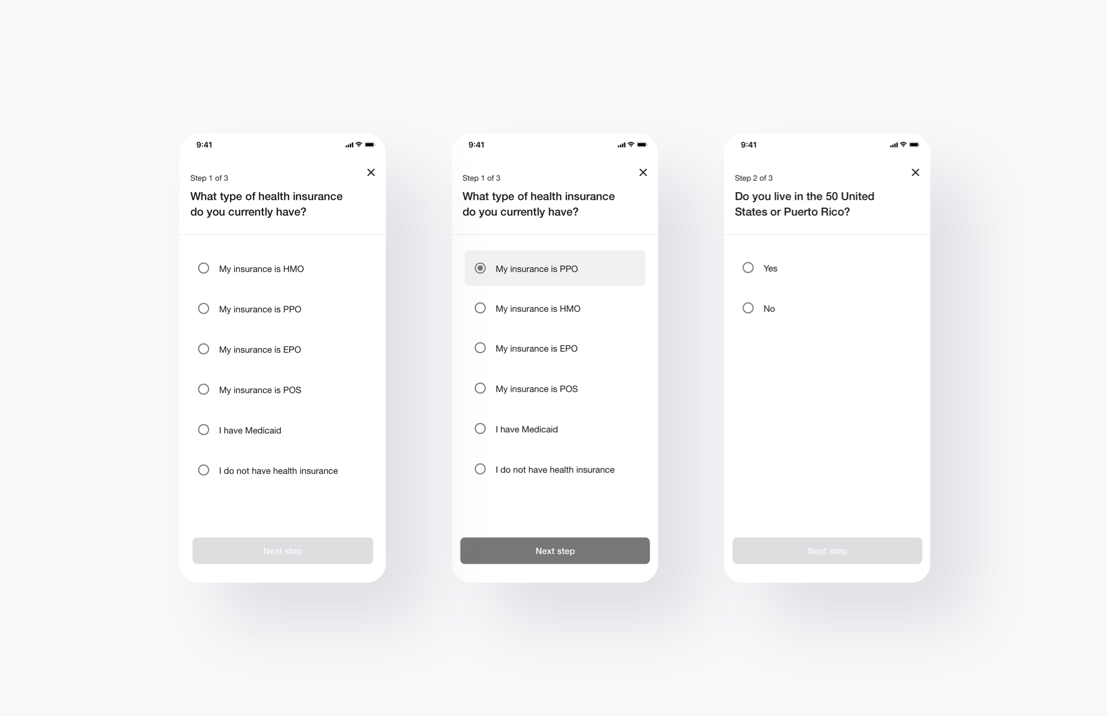
Survey
We designed the survey with a steady pace in mind. There is always a chance that a user might miss tap/click on an answer and be brought to the next step unwillingly. We wanted to avoid that by having the user confirm their selection by tapping the "Next step" CTA on the bottom of the screen.
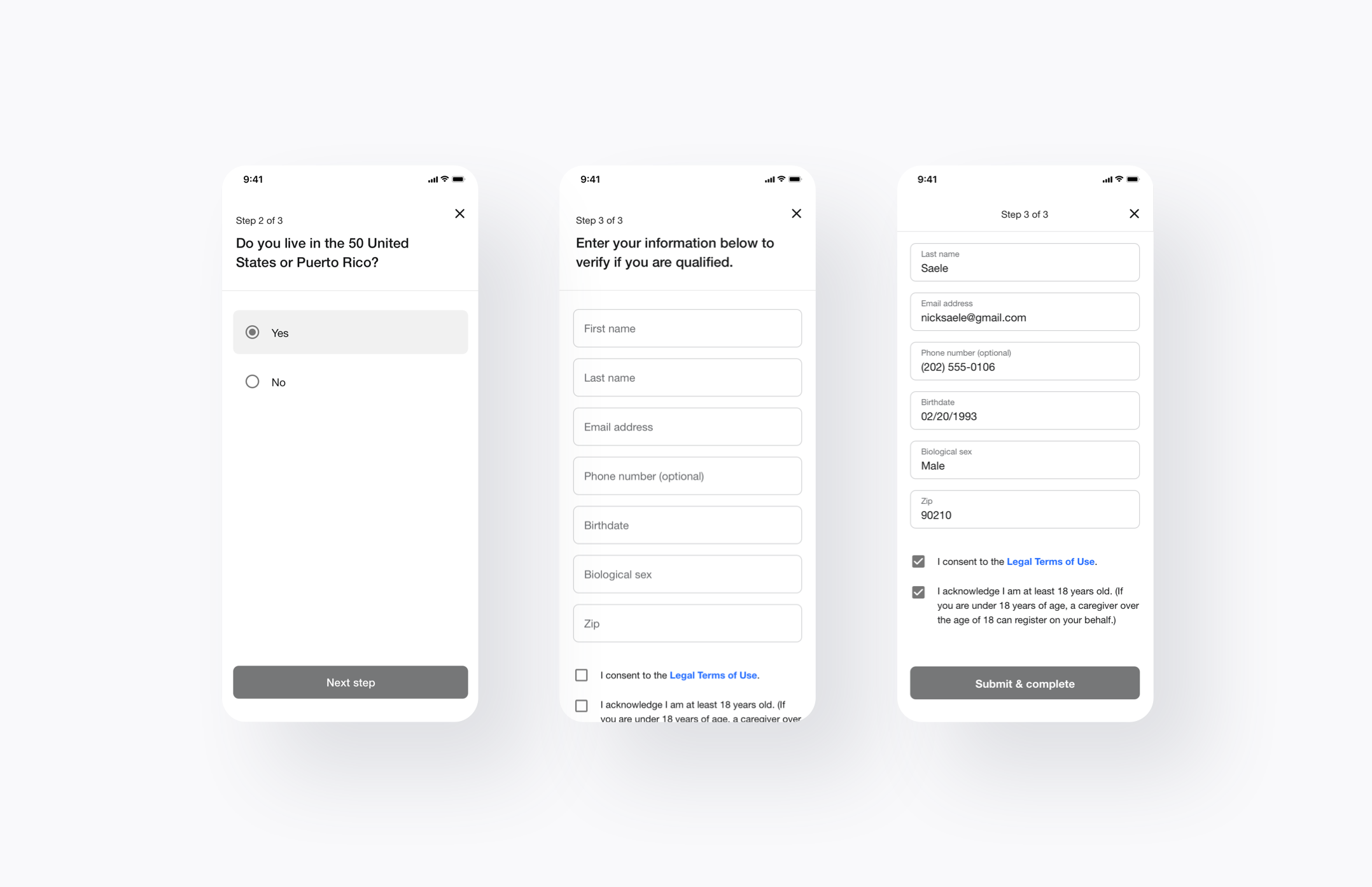
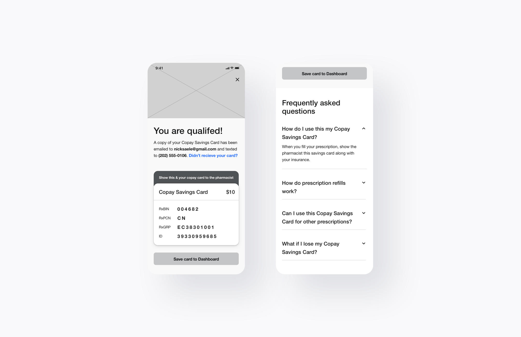
Qualification
When creating the qualification screen for the Copay Savings Card we wanted to make sure that we addressed the following
Confirmation of the user's email and mobile number
A way to resend the Copay Savings Card
Instructions on how to use the Copay Savings Card
A way to save the Copay Savings Card for future use
Addressing any further questions the user may have
High Fidelity
While designing for this feature, we made sure to build all components systematically. This means all elements were built using our Design System 1.0 (for mobile web or desktop) or added for 2.0. Not only does this help speed up building time for the design and engineering teams, but it also helps our designs stay more consistent. We also designed with accessibility in mind meeting the recommended contrast ratios by the W3C.
User testing — insights
All user testing procedures were conducted using usertesting.com. We wanted to get more user insights on the following information
Can they distinguish the Copay Savings Card from a regular GoodRx coupon?
Do they understand that they will need to show the pharmacist both their insurance card and the Copay Savings Card?
What are the user's reactions to the information collections screen? Do they feel comfortable filling out their information? If not, why?
Do users seem willing to go through the flow?
What are the user's thoughts on the process to get to the Copay Savings Card? Was it easy? Was it difficult? What made it easy or difficult? Do they think it was worth it?
If they needed to use the Copay Savings Card again do they understand how to access it?
User testing — target audience
We made sure to target the correct audience when testing our designs. Below indicates our target audience for the Copay Savings Card.
Male & female
Ages 18-80
Lives in the United States or Puerto Rico.
Users that have health insurance and users that do not have health insurance. We wanted to target both insured and uninsured to understand the reaction from users who would not be qualified.
Users that have used our product before and users that have not used our product before.
Users that pick up prescriptions for themselves or someone else about once a month on average.
User testing — results
We ran our designs through several rounds of tests and got great feedback. Many users understood how it worked, filled out their information with little worry or hesitation, and understood how to use the Copay Savings Card. Very few users were confused or did not trust this feature.
feature Results
The Copay Savings Card is performing very well. Currently, we are using CTR & engagement to measure success, however, claims will be the new metric of success moving forward.
Feature CTR (March 27th - May 18th)
Desktop: 71%
Mobile web: 71%
iOS: 66%
Android: 50%
Users that tapped/clicked "Submit & complete" CTA (March 27th - May 18th)
Desktop: 56%
Mobile web: 31%
iOS: 39%
Android: 30%